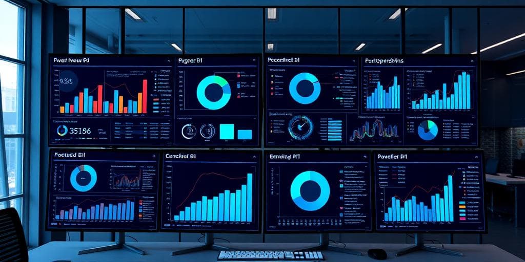
Power BI Dashboard Design: Best Practices for Effective Business Intelligence
Creating effective Power BI dashboards is both an art and a science. A well-designed dashboard can transform raw data into actionable insights, while a poorly designed one can confuse users and hinder decision-making. This comprehensive guide provides expert strategies, real-world examples, and proven methodologies for designing Power BI dashboards that drive business success.
Dashboard Design Fundamentals
Understanding Your Audience
Understanding your audience is crucial for effective dashboard design. Different stakeholders require different levels of detail, visual approaches, and interaction capabilities.
Executive Dashboards:
- High-level KPIs and trending data presentation
- Clean, minimalist design with large, clear numbers
- Focus on strategic metrics and goal tracking
- Limited drill-down capabilities to maintain focus
- Monthly/quarterly comparison views
Operational Dashboards:
- Real-time or near real-time data updates
- Detailed metrics for day-to-day management
- Interactive filtering and drill-down capabilities
- Alert systems for threshold breaches
- Departmental performance tracking
Analytical Dashboards:
- Complex data relationships and correlations
- Advanced filtering and parameter controls
- Statistical analysis and trend identification
- Comparative analysis tools
- Data exploration capabilities
Visual Design Principles
The Psychology of Data Visualization
Effective dashboard design leverages psychological principles to guide user attention and facilitate understanding:
Visual Hierarchy:
- Primary Focus: Most important metrics positioned top-left
- Secondary Information: Supporting details in logical flow
- Tertiary Elements: Filters, navigation, and supplementary data
Color Psychology in Business Intelligence:
- Green: Positive performance, growth, success indicators
- Red: Alerts, declining performance, critical issues
- Blue: Neutral information, trust, reliability
- Orange/Yellow: Warnings, attention-required items
- Gray: Inactive or reference data
Data Visualization Selection Guide
Choosing the Right Visual for Your Data
Key Performance Indicators (KPIs):
- Card Visuals: Single metric display with clear labeling
- Gauge Charts: Progress toward goals with color coding
- KPI Visuals: Trend indicators with variance analysis
Trend Analysis:
- Line Charts: Time series data, continuous trends
- Area Charts: Volume representation over time
- Combo Charts: Multiple metrics with different scales
Comparison Analysis:
- Bar Charts: Category comparison, ranking data
- Column Charts: Time period comparisons
- Waterfall Charts: Sequential change analysis
Performance Optimization Strategies
Data Model Optimization
Star Schema Design:
- Central fact table with dimension tables
- Optimized for analytical queries
- Reduced data redundancy
- Improved query performance
Relationship Management:
- Proper relationship definitions
- Avoid bidirectional filters unless necessary
- Minimize cross-filter impact
- Use calculated tables sparingly
Industry-Specific Dashboard Design
Financial Services Dashboards
Regulatory Compliance Dashboards:
- Risk management metrics
- Audit trail visualization
- Compliance status tracking
- Regulatory reporting preparation
Manufacturing Dashboards
Production Monitoring:
- Real-time production metrics
- Quality control indicators
- Equipment efficiency tracking
- Supply chain visibility
Healthcare Dashboards
Patient Care Dashboards:
- Patient outcome metrics
- Treatment effectiveness analysis
- Resource utilization tracking
- Quality of care indicators
Conclusion
By following these comprehensive guidelines and best practices, organizations can create Power BI dashboards that not only display data effectively but also drive meaningful business outcomes and support data-driven decision-making across all levels of the organization.